
Graphium QCDR · The 2026 Manual · Part 4
How we keep you compliant, and how to read the scorecard.
What our dashboards show during the performance year, why we report what we report and stop where we stop, and a walkthrough of every scorecard panel with real, redacted figures. The complete volume is below, or take it as a PDF.
This volume covers what Graphium QCDR does with your data during the performance year: what the dashboards show, why we report what we report and stop where we stop, and how to read a scorecard. It assumes the program mechanics covered in the companion volume, QPP Program Mechanics.
Where We Stop, and Why
Graphium shows measure performance and data completeness throughout the year. We do not project your final MIPS score or payment adjustment. Published benchmarks are only part of the calculation: scoring floors and caps, category weights, and other CMS adjustments also affect the result. We cannot reliably predict how all of these will apply to an individual clinician or group. Rather than set an expectation we cannot substantiate, we focus on information your team can use now to review documentation and performance. CMS determines the final score and payment adjustment after the reporting period.
CMS publishes historical benchmarks and scoring guidance, but Graphium does not apply all scoring floors, caps, category reweighting, and special adjustments to generate a predicted final score. Budget neutrality affects the payment adjustment and is separate from the calculation of the score. Benchmark tables in these manuals are educational references, not promises of points or payment.
Differences between providers can identify a need to review documentation, measure eligibility, workflow, or care. A percentage alone does not establish the cause.
The Scoring Idea Clients Most Often Miss
A Performance Met rate of 99% on one measure can be worth fewer points than 80% on another.
This is counterintuitive and it is the single most common misunderstanding we encounter. Points are not awarded for your raw rate. They are awarded for where your rate falls in the national distribution for that specific measure. Two examples from the real 2026 benchmarks:
- QID 430 (PONV) is topped out. The national average is 99.34%. A rate of 96% lands in Decile 7. You have to hit a literal 100% to earn the full 10 points.
- QID 404 (Smoking Abstinence) is not topped out. The national average is 79.89%. A rate of 88% lands in Decile 7 as well, and 94% reaches Decile 8.
Raw performance percentages cannot be compared across measures as if they earned the same points. In the QID 430 example, moving from 96% to 99% crosses from Decile 7 to Decile 9. Use each measure’s benchmark and applicable scoring rules to interpret the change; the effort required to improve a measure also depends on the practice.
The practical instruction we give clients is simple: push Performance Met as high as possible on every measure you are eligible for. Under Traditional MIPS, CMS then selects your best six. You do not have to guess which measures will score well, and you do not have to run the decile math yourself. Reporting broadly and documenting well dominates trying to game measure selection.
Under the MVP the calculus shifts slightly. There are fewer measures, only four are counted, and the measures in that pool are generally easier to reach 100% compliance on. The strategy is the same, but the margin for a weak measure is thinner.
The "Without CPT" View: Our Core Differentiator
Most quality reporting is blind until billing catches up. Measure denominators are gated on CPT codes, and CPT codes are assigned by the billing team days or weeks after the case. By the time a traditional dashboard can tell a provider they missed something, the case is long gone and so is the teachable moment.
Graphium produces two views of the quality dashboard.
Without CPT. Available immediately. We drop the CPT requirement from the denominator logic and score everything else from the anesthesia record. This is a prediction, not a submission-grade result, and it lets a group see performance the same day rather than the following month. This is where documentation and education gaps get caught while they are still correctable.
With CPT. Produced once billing uploads coded cases. Identical dashboards, identical layout, now with correctly gated denominators. This is the accurate view and the one that matches what gets submitted.
Running both is the point. The without-CPT view gives you speed; the with-CPT view gives you precision. Neither alone does the job.
How We Gate Denominators Without CPT Codes
Dropping the CPT requirement does not mean guessing. For measures whose denominator depends on the type of case, we ask the provider directly at the point of documentation.
AQI 18 is the clearest example. The intraoperative record presents a dedicated question block:
| Question | Responses | Role |
|---|---|---|
| Isolated CABG surgery | Yes / No | Gates the AQI 18 denominator |
| CPB used | Yes / No | Gates the AQI 65 denominator |
| (if CPB used = Yes) Temp < 37.0°C w/ CPB | Yes / No / None | AQI 65 numerator |
| (if Isolated CABG = Yes) Intubated > 24 hours | Yes / No | AQI 18 numerator |
The conditional structure matters. The numerator question only appears once the denominator question has been answered affirmatively, so a provider is never asked about prolonged intubation on a case that was not a CABG.
This pattern repeats across the measure set. Wherever a denominator turns on something the CPT code would eventually tell us, we ask for it directly so we can score the case immediately and accurately.
Anesthetic type is mapped, not asked twice. Several specifications are written in terms of a neuraxial category that does not appear as such on the record. The form captures the anesthetic the clinician actually delivered, and the coding engine resolves that to the specification's vocabulary:
| Recorded on the anesthesia record | Resolves to |
|---|---|
| General | General |
| Regional | Regional |
| Spinal · Epidural · LABOR Epidural | Neuraxial |
| MAC | MAC |
This mapping is load-bearing rather than cosmetic. ePreop 31's denominator is general, neuraxial, or regional anesthesia care, which excludes MAC, so the mapping is what decides whether a case is eligible at all. ABG 45 (registry code 12A57) accepts MAC, regional, general, or neuraxial, so every anesthetized case qualifies and the mapping does not change eligibility there. Labor epidurals resolve to neuraxial but fall out of ePreop 31 on the surgical-procedure gate, since labor analgesia is not a noncardiac surgical case.
The Clinician-Facing Capture Design
The denominator gating above is not a back-office construct. It is visible to the clinician on the form, and the form's structure is a direct encoding of the measure specifications.
Conditional cascades. Every multi-step measure is presented as a chain where each question only appears once the one above it has been answered affirmatively. AQI 71 is the deepest example, running five levels:
Diabetes mellitus diagnosed → (if Yes) BG prior to Anes Start → (if Yes) Resulting BG ≥ 180 mg/dL → (if Yes) Insulin prior to Anes End → (if Yes) BG tested prior to D/C
A clinician documenting a non-diabetic patient answers one question and moves on. A clinician documenting a hyperglycemic diabetic answers five. The burden scales with the clinical complexity of the case rather than with the size of the measure set.
The answer vocabulary encodes the numerator coding options. This is the part worth calling out, because it is easy to mistake for a UI convention when it is actually the scoring logic:
| Response | Maps to | Appears on |
|---|---|---|
| Yes | Performance Met | All measures |
| No | Performance Not Met | Measures with no denominator exception |
| N-RS (No, Reason Specified) | Denominator Exception | Only measures whose specification defines an exception |
| N-RU (No, Reason Unspecified) | Performance Not Met | Same measures as N-RS |
A measure offering N-RS and N-RU is a measure that has a documented medical-reason exception in its specification. A measure offering only Yes and No does not. Checking the form against the specs, this holds throughout the 2026 set: QID 477 multimodal, ABG 44 low flow, QID 430 combination therapy, AQI 71 insulin administration, and ABG 45 mitigation strategy all carry N-RS because each has a defined exception code. QID 404 and AQI 18 carry only Yes and No because neither does.
Two measures use bespoke third options for the same reason:
- AQI 65 offers Yes / No / None, where "None" captures the case with no documented temperatures during bypass. That is registry code 11A13, which scores as Performance Not Met rather than as an exclusion. The form makes the distinction the clinician needs to draw without requiring them to know the code.
- AQI 48 offers Yes / Pt Declines / No, where "Pt Declines" is the denominator exception at 10A13.
Asked versus derived. Not every measure is a question. QID 424 was calculated entirely from fields captured elsewhere on the record: anesthesia start and end times, primary anesthetic type, and the temperature outcome. Nothing was asked of the clinician for it.
A derived measure costs nothing at the point of care and everything in engine logic. An asked measure is the reverse. ePreop 31 is the extreme case of a derived measure: it requires no clinician question at all, but it does require continuous electronic MAP capture, artifact rejection, and a risk-adjustment model.
Reconciliation: The Billing Team Is Authoritative
When the coded case arrives, CPT codes override the provider's answer. This is a deliberate hierarchy, not a tiebreaker.
A provider may record "this was not an isolated CABG" and the CPT codes uploaded a week later may say otherwise. We take the billing team's assessment as the more accurate one. Coders work from the full operative record with the specific job of classifying the procedure; the provider is answering a checkbox mid-case. Both are acting in good faith and the coder is better positioned.
The practical consequence for clients: a case's measure eligibility can change between the without-CPT view and the with-CPT view, and that is the system working correctly. A measure's eligible count moving between the two views is not an error and does not need to be reported. Persistent, large-scale disagreement between provider answers and CPT codes on a specific measure is worth surfacing, because it usually means the question is worded ambiguously or the providers were never trained on what it means.
An Important Subtlety: Facility vs. TIN
CMS aggregates the final Composite Performance Score by NPI + TIN. Graphium's dashboards are broken down by NPI + Facility.
This is a deliberate divergence and a source of legitimate differences between what you see in our analytics and what CMS ultimately reports.
We break down by facility because that is how anesthesia groups are actually managed. A TIN may span several facilities with different surgeons, different case mixes, different EHRs, and different documentation cultures. Nobody runs a department at the level of "all facilities that happen to share a tax ID." Directors run a site. Chiefs run a site. When a provider's numbers separate from the group, the conversation, the workflow, and the fix all happen at the site.
Aggregating by facility makes the data actionable and makes oversight assignable. Aggregating by TIN makes the data match the CMS submission but leaves no one accountable for it.
What this means in practice: expect facility-level numbers in Graphium to differ from the TIN-level figures CMS reports back. Neither is wrong. They are answering different questions. Use the facility view to manage the practice during the year, and the TIN-level submission summary to reconcile against CMS afterward.
The Views
A note on the measure set shown in these figures. The sample scorecard reproduced below was captured in August 2026, before our reporting engine was synced to the 2026 measure set. It therefore scores the 2025 set: measures retired for 2026 (QID 424, ABG 42, AQI 49, AQI 67, AQI 72) still appear, and AQI 80 and ePreop 31 do not appear at all. The authoritative 2026 measure set is the one in the companion volume, Quality Measures, not the one in these screenshots. The figures are here to show the structure of the dashboard and how to read it, and that structure is unchanged by the sync. Figures will be recaptured against the 2026 set in a future revision.
Illustrative dashboard examples. Organization, facility, and provider identifiers have been replaced with placeholders. These examples show dashboard structure, not the current-year measure inventory.
1. Quality Scorecard header and filters. Organization, date range, and total case count, with the active filter set visible (voided cases excluded, test facilities excluded, anesthesia cases only, cancelled-before-induction excluded). Worth showing because it makes clear the denominator is a clean case population, not a raw export.

Scorecard header and active filters. Organization name redacted.
2. Quality Measure Results table (labeled MACRA Results in the current build). The core view. One row per measure with Incomplete (n), Completeness %, Performance Met %, Eligible (n), Performance Met (n), Performance Not Met (n), and Exception (n).
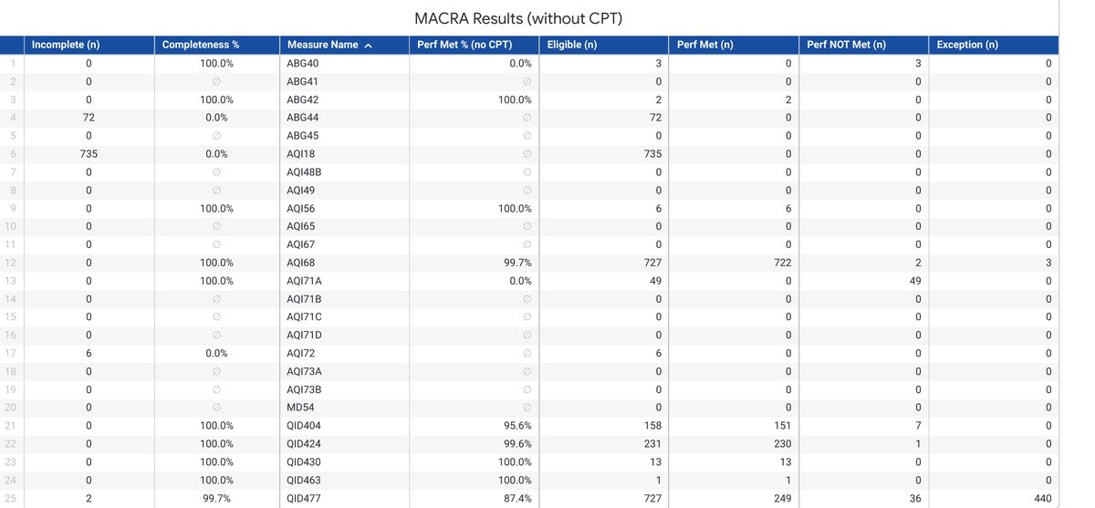
Figure 1. Quality measure results (without CPT). Sample month, 784 cases. Note the contrast between rows: AQI68 shows 100% completeness with a 99.7% performance rate, while ABG44 and AQI18 show 0.0% completeness against non-trivial eligible populations. Those two rows are describing entirely different problems, and the table is what lets you tell them apart at a glance.
This table is where most problems surface, and it surfaces two distinct kinds:
- A low Performance Met % with high completeness is a clinical or workflow issue. The documentation is there and the action was not taken.
- A low Completeness % with a large Incomplete count is a documentation issue. The action may well have been taken; nobody recorded it. The table separates measure performance from missing documentation, so your team can identify what needs review. For 2026, a submitted measure below 75% data completeness generally earns zero points; small practices receive three points. This is a measure-level rule, not a zero assigned to each incomplete case.
One caveat on reading that second case. A measure at partial completeness is almost always a documentation gap. A measure at exactly 0.0% completeness across its entire eligible population usually is not, because it is implausible that every clinician missed the same question every time. That pattern points at capture logic rather than at clinicians: a denominator gate that is admitting cases the measure should have excluded, or a numerator question that is never being presented. Raise it with us rather than with your providers. It is the one row on this table where the fix is ours and not yours.
Separating these two failure modes is the single most useful thing this table does, and it is worth an explicit callout in client training.
3. Facility Quality Measure Results. Same measures, one row per facility, showing % Met with the numerator and denominator exposed as (n/d). For a single-site group this collapses to one row. For a multi-site group this is where site-level variation becomes visible.

Facility-level results. Facility name redacted. In a single-site group this collapses to one row identical to the totals.
4. Provider Quality Measure Results. Per-provider Performance Met with (n/d) for every measure. This is the view the whole product exists to produce.
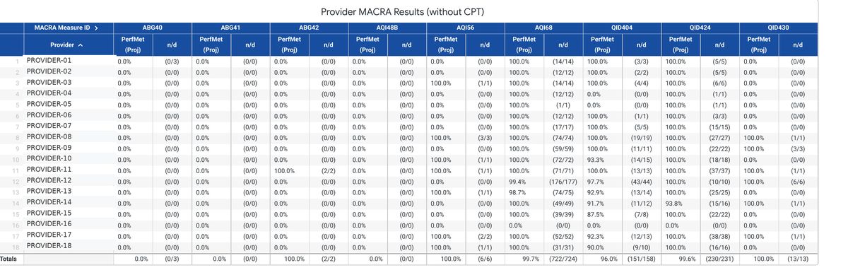
Figure 2. Provider-level quality measure results (without CPT), provider names redacted.
Small denominators mean a single case can swing a provider's rate several points, so read the (n/d) alongside the percentage rather than the percentage alone. A provider at 87.5% on 8 cases and a provider at 92.3% on 13 cases are not meaningfully different. A provider at 0% on 40 cases warrants review of documentation, eligibility, and the care recorded.
5. Provider Quality Results. Non-QPP quality items tracked per provider: handoff protocol used, postop pain control, surgical safety checklist, medications documented. These are not MIPS measures but they map directly onto Improvement Activity documentation and onto internal QI programs.
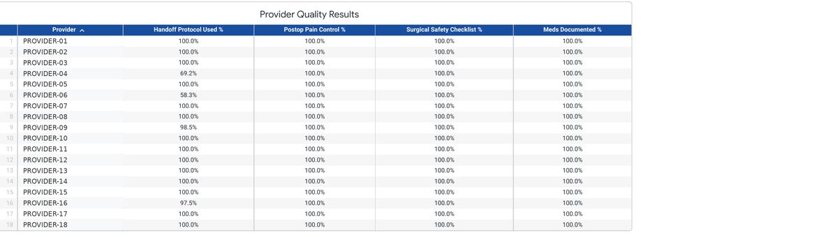
Non-QPP quality items by provider, names redacted. Handoff protocol is the discriminating column here; the other three sit at 100% across the group.
6. Complications panel. Major and minor complication counts and rates, plus discrete counts for unexpected deaths, unplanned cardiac arrests, corneal abrasions, and failed regional anesthetics. Feeds internal peer review and supports IA_PSPA_7 and IA_PSPA_19 attestations.
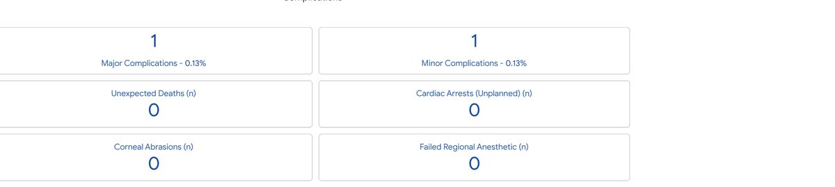
Complications panel. Rates are shown alongside absolute counts because at these denominators a single event moves the percentage substantially.
7. Complications stratifications. Complications plotted against ASA physical status and against age decile, appearing below the panel above. At low event counts these charts are illustrative rather than analytic, but they are useful for framing a departmental quality meeting and they serve as evidence for an IA_PSPA_19 attestation.
Participation in Graphium QCDR does not guarantee satisfactory participation in the CMS Merit-based Incentive Payment System. Successful submission is contingent upon each eligible clinician or group meeting MIPS program requirements and the timeliness, quality, and accuracy of the data provided. This volume is informational and is not practice-management or legal advice. Figures are from a live client scorecard with all identifiers removed.
CMS references
For the 2026 performance year. Use current CMS guidance alongside these Graphium educational materials.