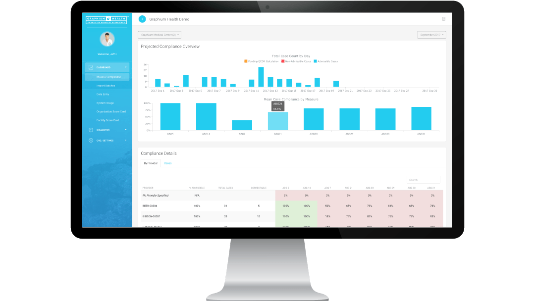
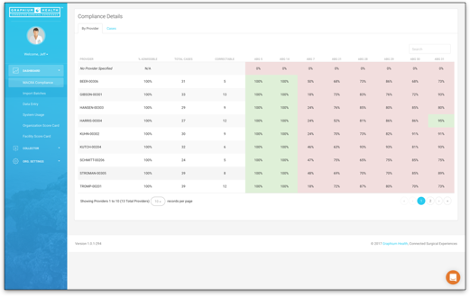
When you use Graphium Health MACRA as your reporting method of choice, you get access to our MACRA Compliance Dashboard. It will show you, within any given organization across a given month, each day:
How many cases is each provider doing?
How are they matching up for each of the reportable measures?
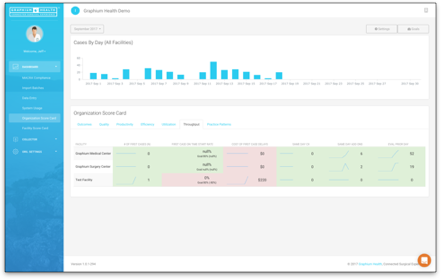
How is each facility currently doing?
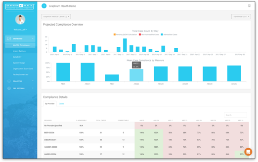
The MACRA Dashboard allows you to drill down into any provider’s performance to get a deeper understanding behind why they are or are not achieving MACRA compliance to a level that your organization desires.
You also get access to your organization’s quality data and see how whole facilities or individual providers are performing in regards to handoff protocol being used, post-operative pain control, normothermia, and surgical safety checklist being utilized.
Furthermore, you can pull up any month at any given facility to view 39 minor and major complications that occurred, when they occurred, what the complication was, whether it was major or minor, and which providers were involved.

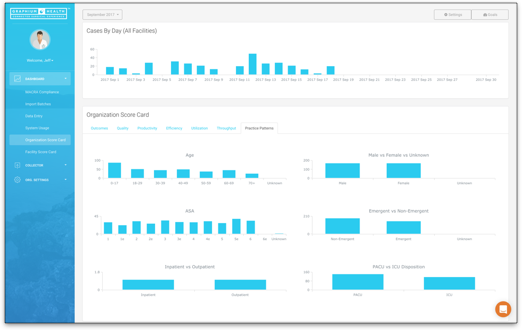
We provide a “Practice Patterns” dashboard, which is a look at population health across your organization. You can look at any facility across a date range and view your age distribution, ASA distribution, emergent vs. non-emergent, gender distribution, inpatient vs. outpatient, and how many patients go to PACU vs. ICU. This is of the most interest to an organization with multiple facilities, who can use the dashboard to compare facilities across their organization or identify facilities that are at risk. They can see why so many complications are occurring or find out why so many cases are going to ICU. Perhaps it’s because so many of their cases are ASA 4 or greater, or there are more emergency cases, etc. So it makes the providers feel safer with data driven reasons why their performance might be different from, say, a surgery center down the road with a different patient population.
MACRA SIMPLE vs. MACRA PLUS
Both of our MACRA reporting plans cost the same and offer the dashboards above. Also, both of our plans provide the following reports:
- MACRA Compliance
- Daily case volumes by Facility
- Daily case volumes by Provider
- Population health data by Facility
- 39 Outcomes tracked
- 4 Process measures
Some Graphium clients also use this data in their OPPE Credentialing process. We work with them to build monthly reports to look at each individual provider’s MACRA Measures, Quality measures, and outcomes.
We also have clients who need quarterly quality reports as required by the Joint Commission for all third-party hospital providers. We can surface the data that is collected on the Simple or Plus form in a variety of different ways.
Our primary effort, here, is to demonstrate that this is all less about MACRA or tracking OSA education, and more about taking a more holistic approach to what can otherwise be an annoying process and leveraging the data available to create as much value as possible. Hopefully you get a sense that once you add a couple of data points here and there, requiring very little from a data entry perspective, an organization-wide quality program can begin to develop with MACRA Compliance as a secondary concern.
MACRA Plus
If that line of thought appeals to you, then you may want to look closely at utilizing our MACRA Plus form. There is no additional cost, but there is some compelling additional value.
Typically, our larger groups that need to be competitive in the marketplace to secure and protect hospital contracts are utilizing this form to surface Operational Insights to not only improve performance where possible, but also to demonstrate value to their current and differentiate themselves with a stronger value proposition to their target market.
On the Plus form, there are 6 additional time stamps:
-Scheduled Start Time
-Case Start Time
-Surgery Start Time
-Anesthesia Ready Time
-Surgery End Time
-Anesthesia End Time
Combined with the additional operational checkboxes in this section, our Plus clients receive a total of 18 additional operational metrics. Those reports include:
-Surgeon Turnover Times
-Surgeon Turnover Times when they Flip Flop rooms
-Anesthesia Ready Times
-Surgery Prep Times
-Wheels-In/Wheels-Out Times
-Anesthesia Turnover Times
Getting to look at these intervals really adds insight into where operational inefficiencies are occurring. Surgeons are always telling you that things are taking forever, and it’s never their fault, as will other providers. With reports like these, practices are using data to help change conversation or help partner in more constructive ways with administration or surgeons to help effect change.
4 more reports that we include are Prime Time Utilization, Cost of Under Utilization, Early Morning Utilization, and Evening Utilization.
Prime Time Utilization
This is from 7am-3pm- how many rooms are under budget across those hours, and then how many minutes are you actually using for each hour across that time block
Cost of Under Utilization
If you can give us how much cost it is per minute at your facility, we’ll actually give you what you cost of under utilization is. Most facilities want to target 75% utilization of their time, and if they only come in at 52% (for example), how many minutes did that 50% under utilization actually cost?
Early Morning Utilization & Evening Utilization
These two reports offer the same information across different time periods: Midnight-7am (Early Morning) and 3pm-Midnight (Evening).
In addition, we are capturing other data that offers insight into your practice:
-# of First Cases
-First Case On-Time Starts
-Cost of First Case Delays
-Case Delay Reasons
-# of Same Day Cancellations
-Cancellation Reasons
-# of Same Day Add-Ons
-# of Patients Evaluated the Day Prior
Your choice between using MACRA Simple vs. MACRA plus really comes down to what’s in your best interest, which you know better than anyone. If you are a GI center with 2 minute turn arounds and everyone is happy, there may be no sense in using the plus form.