Literally dozens and dozens of analytic reports can come out of an anesthesia practice. In order to identify which one is the most valuable or the most interesting, I really think it’s helpful to look into general categories such as productivity, efficiency, throughput, patient safety, to name a few.
Within each one of those categories, there are dozens of different reports, which shows the reality that our anesthesia record is just loaded with lots of really distinct information. When you think about time stamps, check boxes, radio buttons, identifications of people, OR locations, it’s just data-rich. And, too often, that data is just overlooked. We don’t recognize the value that’s right in our hands. And I think, historically, it’s because it was typically on paper, and once that’s on paper, the reporting value is simply lost. It’s there for medical/legal reasons, but you can’t run reports on a bunch of papers in a filing cabinet.
Over the past 10 years, we’ve transitioned to more electronic documentation, but those systems still have not really produced analytic reports or a culture of looking at objective continuous analytics and reports that provide real value, especially if you want to compare facilities against each other. So, if one facility has two different electronic vendors, it’s very difficult to compare. Even when they’re the same vendor, it becomes very difficult to have any kind of aggregated comparison between facilities, which really limits the ability to bring analytics to bear for any group that services multiple facilities.
But assuming you can unlock the potential of that analytic value, I think one of the most interesting places, one of the most, I would say, surprising types of reports that you can get out of the anesthesia record is actually OR utilization.
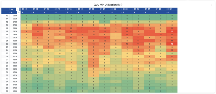
It doesn’t require any additional fields. All you need to capture is the anesthesia team members, the surgeon of record, the OR location, the time that you started your anesthesia (typically when you rolled into the OR), and the PACU arrival time (about a minute or so after you left the OR). With those five data points, you can get some really interesting information. For example, you can develop heat maps that look at each 30-minute block throughout the day for every day of a given month and show how many locations you were running at that 30-minute interval.
The result? Beautiful heat maps where you can easily and quickly look at an entire month and answer:
- “What did overnight look like?”
- “How many rooms were we running?”
- “What did 3 o’clock look like?”
- “What did 5 o’clock look like?”
- “What did 7 o’clock look like?”
The heat map visualization makes it easy to look at each month and compare those different time blocks. Without that, you’re really relying on people’s memories and emotions. But we’re all human, and the reality is that you can really get slammed one or two nights a given month, and that frames your entire perspective of how hard something is. But as soon as you start getting into the world of hard and fair, you’ve started on a slippery slope that can only be countered with data. You can actually look at how many locations were truly running, and how that compares among surgeons, among physicians, among the CRNAs. And once you have that power, you can start reshaping that data. Once you’ve looked at the heat map for a given month, you might want to then combine all the data from that month into a bar chart. Now you have a whole new set of information:
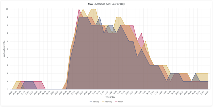
For each 30-minute increment throughout the day, what is the highest number of locations running?
At 7:30 for the month of January, what was the highest number of locations I was using? And then at 8 o’clock?
What’s the worst case scenario of what we’re actually using?
Now that is an interesting graph. But you can do even more now. Move the data around a little and create another visualization using the exact same five data points, and you have a third view that is looking at the maximum location utilization.
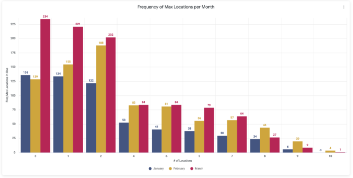
Let’s just say at 7:30 the max number of locations running was 12. Well, that’s great, but during that month or that quarter, at how many different 30-minute intervals did you actually need 12 locations? And what does that look like for 11 locations, 10 locations, etc.? And if you do that for every location, we see this really interesting cliff on our new line chart. Almost everyone we work with uses a certain average number of locations, and you’ll see these minor ups and downs throughout the day. But then when you get to the upper end of your max location utilization, there’s this precipitous drop!
That is really where there’s a lot of value to be found for the bottom line. How often have you had 12 locations that are indeed needed in a given quarter? What if it’s only three different 30-minute blocks? That’s only 90 minutes of time over a three-month period where you really needed 12 locations to be running concurrently. And what if you backed it up, and 11 locations, you only use that six times out of the entire three months? Now you know that you can dramatically reduce costs where you may have two FTEs, for example. And not only does the anesthesia team benefit, but also consider the hospital’s cost savings from the staff to the time that it takes to run those two ORs.
Now you begin to ask some really interesting questions. Is it worth having those extra two ORs available? Is it worth those extra 30-minute blocks? Is it worth the cost? What if we cut those out and we re-shuffled the existing, let’s say, 9 locations. Can we still run our business? How many times will we have to say no to the surgeon if we reduce the number of max locations we’re covering? It’s really where the rubber meets the road. It really helps the CFO understand how much of the available resources is actually being used, and it allows them to make informed decisions.
But answering all of these questions requires data. The reality is that we have the data already on our forms, you just need to have the right tools to unlock it and replace memory & emotion with data-driven decision-making.


